Tonal Adjustments (Lightening, Darkening, Adjusting Contrast)
Sometimes we get a photo that is too light, too dark, or looks like it has a layer of haze over it. Adding contrast will usually fix the haze, and all three of these problems can be easily taken care of in Photoshop or other imaging program.
There are several lightening/darkening tools in Photoshop. The most powerful tool is Curves, which P. Elements (little brother of Photoshop) does not have. The second choice is Levels, which is powerful in itself, and most programs have it. Then there are simple Brightness/Contrast slider tools that work in many cases.
This post focuses on Levels.
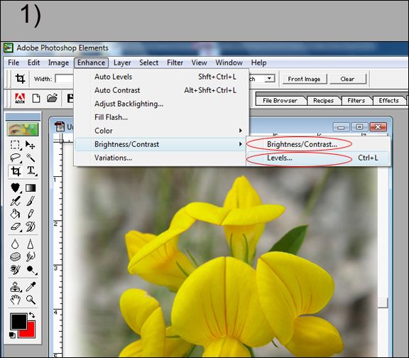
1) To access Levels, use drop down menu Enhance > Brightness/Contrast > Levels.
At this point you can also select the Brightness/Contrast sliders, circled below, but Levels can do more.

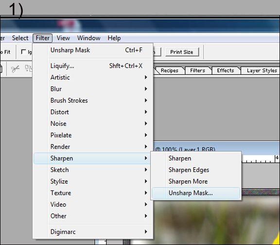
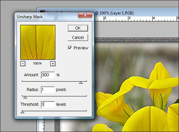
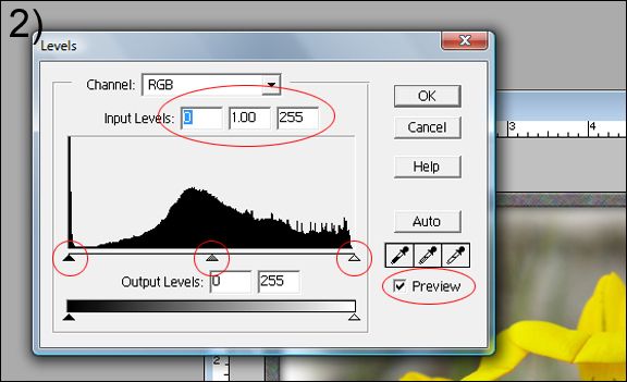
2) The Levels work box will appear. The main things to look for are circled in red.
Input levels: These numbers will change automatically as you adjust the sliders below. Unless you know exactly what numbers you need to enter, which is rare, look at the 3 sliders below.
- Black slider (on Left). This will adjust the dark portions of an image.
- White slider (on Right). This will adjust the light portions of an image.
- Gray slider (middle). This will adjust the mid-tones of an image.
If an image is too dark, click on the white slider and move it to the left. Then grab the gray slider and move it to the left too. Experiment with these two sliders until you like what you see. You likely won't need the black slider since it will only make the dark tones darker.
If an image is too light, use the black slider, move it to the right, then move the middle one to the right also. Experiment and adjust to taste.
If an image is neither too light, nor too dark, but looks like it has a layer of haze over it, it needs a contrast adjustment. To fix it, make the dark areas darker, and the light areas lighter. Use the black and white sliders for this. The gray slider can be used to fine tune the final result.
Tip: Use the Preview check box to see the difference your adjustments have made compared to the original image. Check it to see your changes, uncheck it to see the original image. When satisfied, click OK.
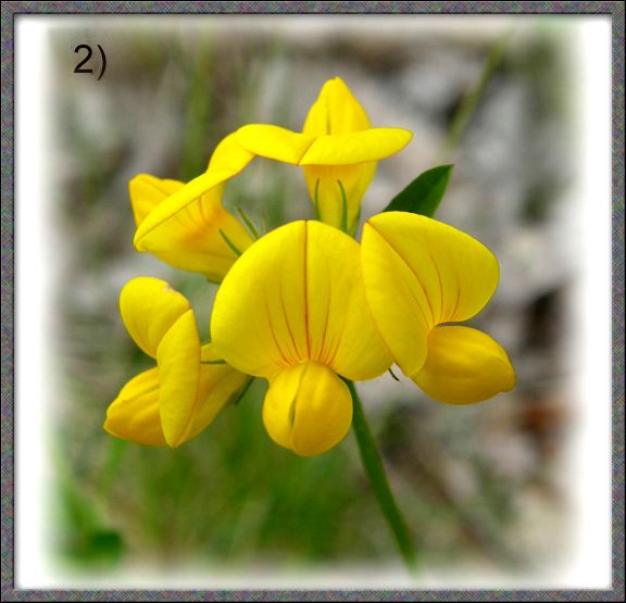
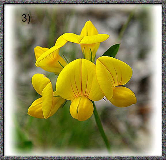
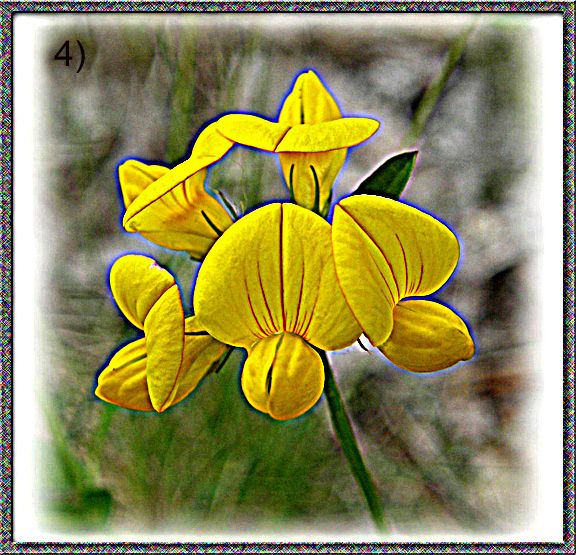
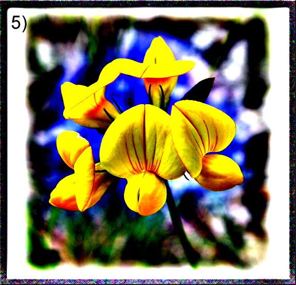
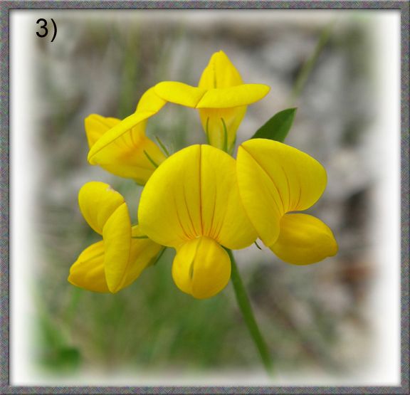
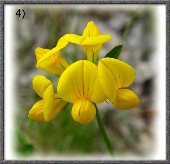
Here is an unadjusted image, then an adjusted one. The Input Levels in the final image are 37, 1.08, 2.31.
3) Unadjusted Image
4) Contrast added. The difference here is subtle, because the original image needed very litle tonal adjustment. The final result is definitely a matter of taste.