My Website, what do you guys think of it?

by Yizuman 21 Replies latest jw friends

  • Yizuman
    Yizuman

    Skyman wrote: "I like the information you have on your web page but when you first look at the page you don't know what you page is about. I think alot of people will just leave with out trying to figure it out."

    What is it that my site confuses you about and what can I do to make it better?

    Thanks

    Yiz

  • googlemagoogle
    googlemagoogle

    i'd add labels to the buttons on top. they may seem pretty self explaining, but labels explain it better :-)

  • nicolaou
    nicolaou

    Hi Yizuman

    I also use mambo for my site at www.theWatchtower.org but I couldn't get on with the peekmambo templates. Why not try the offerings at mamboteam.com?

    Good luck.

  • lazyslob
    lazyslob

    I was thinking if we sign as members/users you can promote your site as "see here just after one month we have xxx number accounts"

  • Yizuman
    Yizuman
    lazyslob wrote: " I was thinking if we sign as members/users you can promote your site as "see here just after one month we have xxx number accounts"

    So I ask for an opinion on my site and you think I have some hidden agenda?

    Uh not exactly how I was thinking. But on the other hand, that would be nice. But that wasn't my intent atm, just wanted to see how my site is and what I can do to improve it.

    Yiz

  • Yizuman
    Yizuman
    nicolaou wrote: "I also use mambo for my site at www.theWatchtower.org but I couldn't get on with the peekmambo templates. Why not try the offerings at mamboteam.com?"

    What is it about the peekmambo templates that bothered you? Can you explain a little more?

    Sorry, but little explainations gets lost on me and I need a little more understanding.

    Thanks for the suggestion as I will see what is it they have to offer.

    Yiz

  • El Kabong
    El Kabong

    Yiz:
    Overall, it's a nice site with lots of good information. I didn't know about that problem that Zone Alarm was having until my Zone Alarm crashed yesterday. So, the info you have on your site already helped me out.

    Do you comb the internet yourself for these articles? Layout looks OK now.
    Good job Yiz!

  • M@el5trom
    M@el5trom

    First, go to the bookstore and get the book:
    Don't Make Me Think, by Steve Krug (website usability book) - very useful for designing pleasing websites that people can and will use
    (and no, despite the title, it does not draw you back to JWs)
    Here's my observations (I'll be brutal, hope that's ok).
    Here's a couple things I liked: Good color selection, nav menu (with the exception of no underlines for links) looks nice, good fonts/sizes.
    Now, onto the critiques:
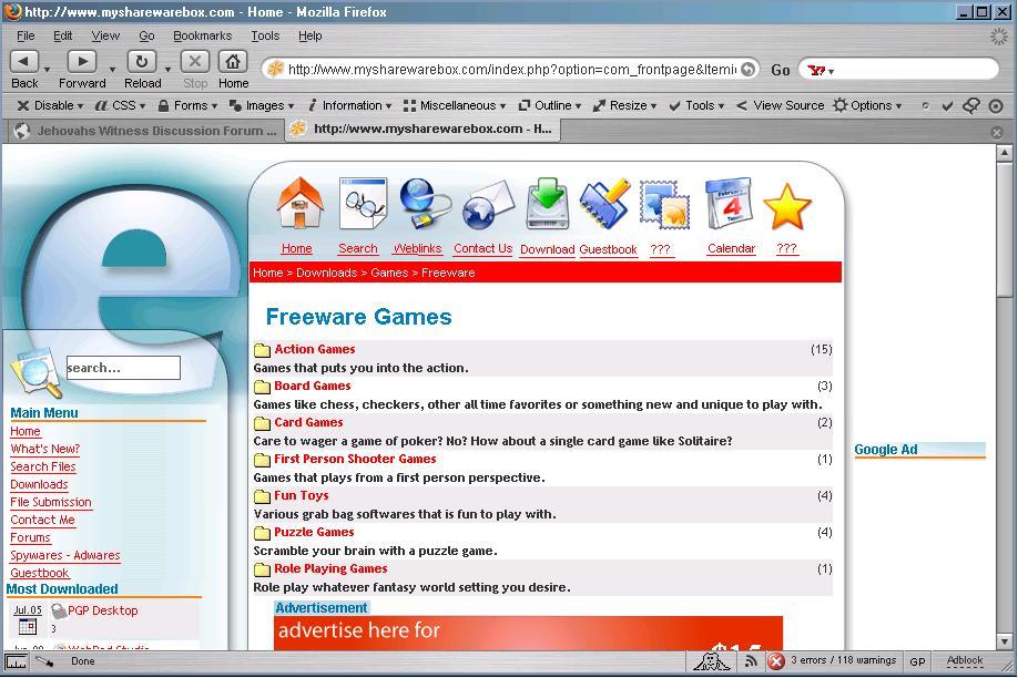
    It wasn't clear to me what the site is about. There are too many things happening on the home page and I don't have a clear idea of what I'm supposed to do/click on/etc. (speaking of things to click on - it generally a good idea to leave the underlines for links instead of removing them like in the menu)
    The icons across the top make no sense to me as far as what they mean - they either need a description word underneath or they need to go. Smaller icons would work especially with a word of description, I think. I assume that this is the main navigation for the site (along with the nav menu on the left)
    The bread crumbs navagation right under the icons at the top should at least be left justified - in the center I thought the Home referred to the icon above it and it doesn't stand out at all. It should be on a colored background or something to set it apart.
    Get rid of the advertisement at the top if at all possible - very tacky and you hate to give up prime real estate above the fold if you don't have to. Is that how the site plans to make money - by selling ads? If so, I would move it to either partway down the page or to the bottom, especially on the home page. If that isn't an option, just keep in mind that right now, that seems to be the most important element on the screen. If that is ok, then leave it as is, but if you want the rest of your site to stand out, it's apparant importance needs to be minimized. Also consider putting the Google ad on the right hand side in a third column instead of above the navigation if you can - that would be a big no-no.
    Content section - why does the home page include a bunch of articles and links to news stories? That should go on a seperate Industry News page and leave your home page for a brief description of what people can expect to find and do at your site. That would go a long way to explaining what your site is about and if they are in the right place or not.
    I hope this doesn't come across too harsh - the site looks good, just needs to be rearranged a bit and cleaned up, I think. Here's a really quick JPG I did for you to see what I was thinking - quality got shot up when saving to JPG of course - you can click it for the full size image - I made it a bit smaller for the forum:

  • lazyslob
    lazyslob

    "So I ask for an opinion on my site and you think I have some hidden agenda? " Absolutely not.I was thinking if I can help you.

  • Yizuman
    Yizuman

    M@el5trom, I moved the google ad down to the bottom of the menu bar so it's not on top. There is no support for the right side as there is no code from the CSS template on it for the right side. The links for the icon menu on top, well it's a Mambo template, so I dunno if I can edit this right. I could email you a zip file that contains the CSS templates and the Index.html as well as the images. If you want to edit it as is and email it back to me re-zipped, I can nuke the old one and reupload the newly modified one. If that is, you are familar with Mambo (www.mamboserver.com). What I was thinking of in terms of the menu icons is to edit it and place texts underneath each one, so they know what's what. Some of the image icons I have no use for as it is built in, so I'm looking for useful ones to replace them. The search icon, I found a magnifying glass one, very 3dish and will try to replace that, hope I don't screw it up. I'm looking thru the backend admins to see if I can make it a underlined link, there's alot of features here I'm still trying to figure out. Sighs, still alot of work cut out for me. The news articles, I tried to make them a new section for it, but problem is the comment sections below won't show up unless I assigned them to the front page. I don't know why it won't show up else where. Any Mambo users can help me out? Bottom line is I'm not very PhPish, I'm more old school in HTML, but I like to be able to have comments section for my site, so I don't know how to build one from scratch. I'm still doing alot of research and reading the Mambo forums for ideas. Yiz

Share this

Google+
Pinterest
Reddit